A house becomes a home and your personal space when you lend it character and personality. And one of the best ways to do that is by introducing tasteful contrast in interior design. Pairing light and dark tones or shades that lie towards the opposite ends of the spectrum can do wonders, if you go about it the right way. At BlueMasons, we keep things modern and classy. Which means, we use colours that are timeless, elegant and not visually jarring. But we still achieve to bring in contrast, so that different rooms get a unique depth, layers and look. We also experiment with different materials and textures to enhance the colour palette, so that every element stands out beautifully. To know more about our high contrast design ideas, check out these 7 images.
1. Magic with wall panel
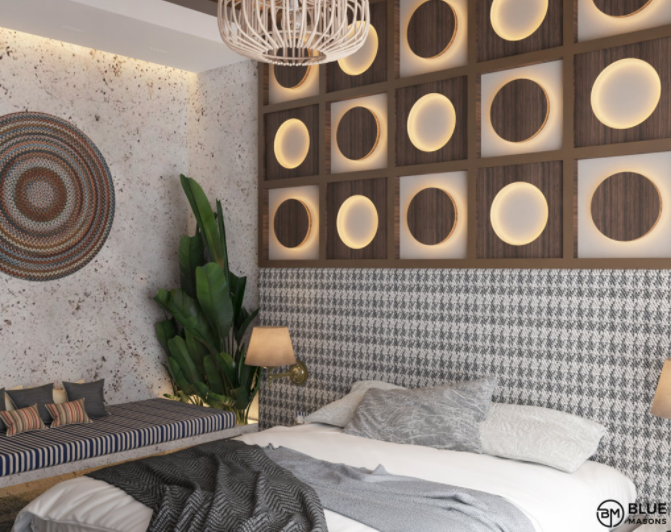
In this relaxing bedroom, the wood and cream wall panel right above the headboard is a brilliant contrasting element. Inspired by chessboards, this panel contrasts the white and grey environment of the room nicely. Accent lighting makes the unique design stand out. Also note how we have used prints and patterns on the headboard and bench to add visual interest. The lush green potted plant in the corner does a good job of adding life and brightness to the setting here. So, the idea is to not go overboard but still define different areas of a room.
2. Chairs that pop
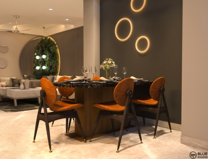
Why is contrast important? So that your interiors don’t get boring. This dining space is a fine example of what we are trying to say. The cream flooring and the dark grey accent wall create wonderful contrast here. But they wouldn’t be so appealing if the quirky chairs with bright tan seats and backrests were missing. Observe how the chairs pop in a lively manner and yet don’t look out of place. The circular lights on the accent wall are a unique touch here.
3. Dark grey to the rescue
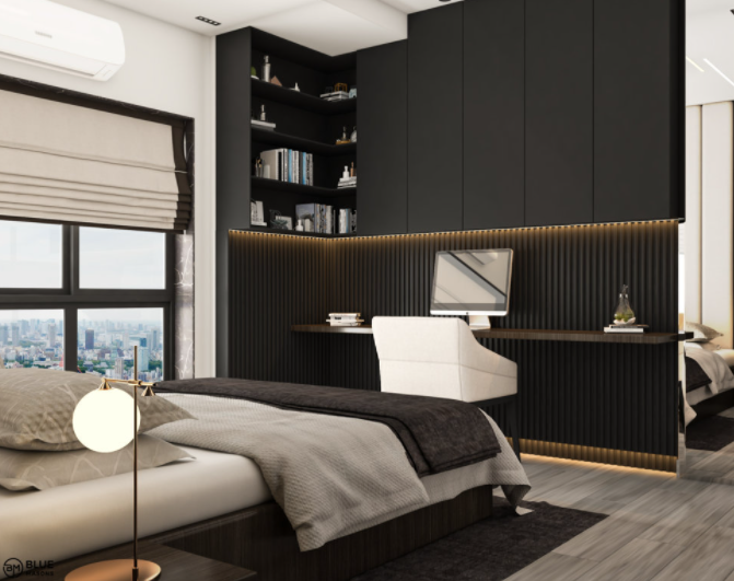
If you are looking for high contrast interior design inspiration, this is right up your alley. This bright and mostly beige and white bedroom would have looked bland had it not been for the dark grey workstation. The dark grey wall cladding around the sleek desk features cool stripes, which have been accentuated with golden cove lighting. The L-shaped overhead storage unit is both smart and aesthetic, with its open shelves and smooth cabinets. Don’t miss how the trendy white chair stands out against the dark grey tone. The overall look is chic, interesting and extremely balanced. The rug and throw add hints of contrast too.
Also Read: How BlueMasons Uses Neutral Colours - 6 images you will love
4. Small doses of white
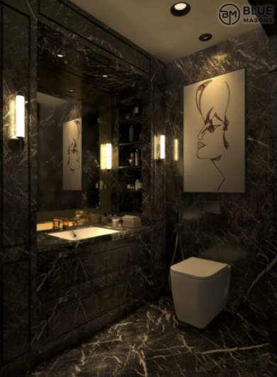
This lavish bathroom is a great example of dark modern interiors. It is clad almost entirely with dark grey and veined marble. Even the large vanity unit looks like a seamless part of the space, offering visual homogeneity. The softly glowing contemporary sconce lights add to the mysterious and cosy vibe here. But the two things that make it all intriguing is the stylish white toilet and the large white sketch. We used small doses of white to break the monotony of dark grey in this luxurious rejuvenation space. And it worked!
5. Experiment with grey and green
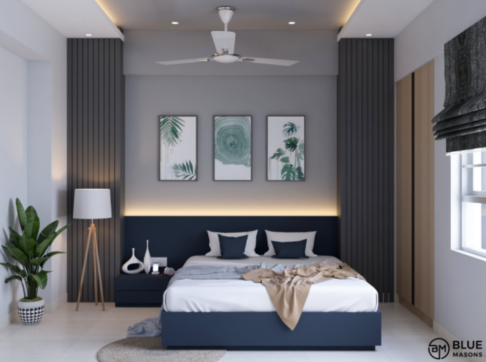
This serene bedroom is mostly bright white and gets loads of sunlight as well. Which is why, we got a little adventurous as interior decorators and designers. We introduced two different shades of grey in the contemporary bed and the slatted wall panels on either side. These greys allow the white bedding, the white knickknacks on the side table and the white tripod lamp to stand out. We also used shades of green in the framed artworks behind the bed to complement the potted plant on the left. Natural elements in the artworks add to the beauty of it. Note how we used dark grey blinds for the window – they not only lend contrast, but also block out light when you want to catch a nap. So, if you are still wondering why contrast is important in interior design, this room will give you the answer.
6. Fashionable in brown and beige
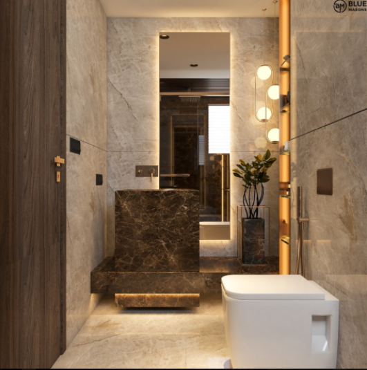
Beige marble takes this compact bathroom to a whole new level of wow. Its generous use makes the room seem spacious and tranquil as well. The tall mirror with backlighting and the golden pendant lights create a dramatic ambience here. So, our thought was – what are contrasting colours that go well with each other. And we zeroed in on a sophisticated and dark shade of brown for the sink unit. We also used it to define the planter in the corner. And the best part is that the brown marble complements the wooden door wonderfully. So, basically, simple contrasting colours, neat lines and creative lighting did the trick!
Also Read: Understanding Role of Colours in Interior Design
7. Opposites are attractive
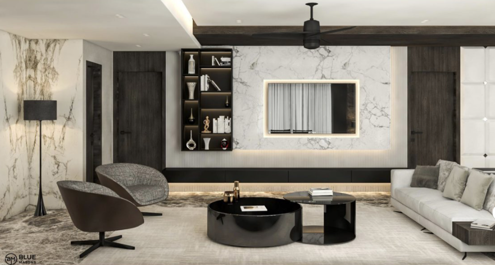
If you are interested in dark modern interior design but don’t want to compromise on the brightness aspect, this living room image will give you tons of ideas. Why? Just the right splashes of dark grey and black have been used here to contrast the beautiful white marble surfaces, rug and sofa. The TV unit is a grand affair, with dark grey surrounding a white backlit panel. The trendy shelf on the left lends bold contrast here. We also introduced a couple of chic dark grey chairs and a sleek floor lamp to set the fashionable look. And the glossy, curvy coffee table in black is just what we needed to pull all the elements together. It pops beautifully on the plain white carpet.
So, what are you waiting for? If contrast in interior design is something you are looking for, let these images give you all the ideas. But make sure you keep the dimensions of the room, availability of natural light, and your budget in mind, before going ahead. And if you feel that some expert help can make your life easy, contact us at BlueMasons today. We will put together something incredible for you, something that reflects who you are!


